We’ve all heard it before, “The reader only gives you two seconds to grab them before turning the page.” Well, if that’s all you worry about, you end up with one-word headlines on a fluorescent background. For my part, I figure it’s not how much time the average reader spends looking at an average ad, it’s about giving them something far from average to ponder for as long as it takes to produce the desired results.
The Client: St. Ann’s Community
The Agency: Adam Fornof
The Assignment: Advertise the advantages of retiring at St. Ann’s Community at Chapel Oaks.
The Answer: Let seniors know they can have all of the comfort of home with none of the responsibilities. And this place is gorgeous. This assignment was the basis for the 7th “Next Top Copywriter” contest.
The Client: Tompkins Trust Company
The Agency: Nagel & Summers
The Assignment: Highlight the bank’s strengths by showcasing their customers’ successes.
The Answer: Talk to business-leader customers in every market of the company and share their first-hand experience of the Tompkins difference.
The Client: Tompkins Trust Company
The Agency: Nagel & Summers
The Assignment: Make Tompkins Trust company stand out among mortgage lenders.
The Answer: Create a print and digital ad campaign that highlights the wide selection of mortgages and lending expertise available from the borrower’s new neighbors at Tompkins.
The Client: Vanderstyne Toyota
The Agency: Sundance Marketing
The Assignment: Support the University of Rochester and their students at the same time.
The Answer: Create an ad for campus publications that offers students serious savings on a great car.
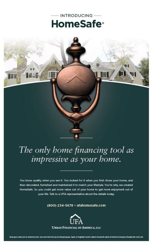
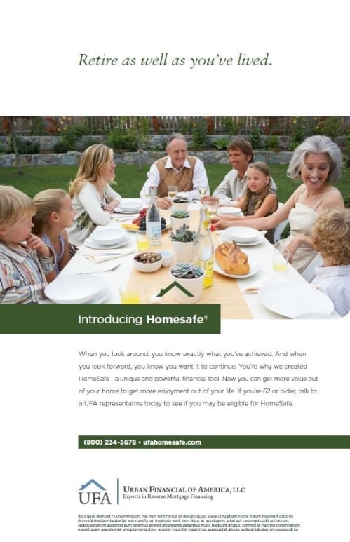
The Client: Urban Financial Group
The Agency: Rayfield Design
The Assignment: Introduce a new, exclusive reverse mortgage product for high-value homes.
The Answer: Create a campaign that speaks to pride, achievement and of course, exclusivity.
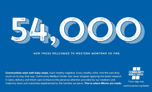
The Client: Community Medical Center
The Agency: David Pavelka Creative Services
The Assignment: Celebrate Community Medical Center's history in maternity care in Montana.
The Answer: Let the numbers speak for themselves and thank the staff who deliver quality care every day.
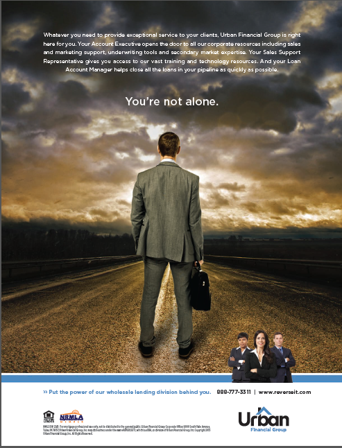
The Client: Urban Financial Group
The Agency: Rayfield Design
The Assignment: Make loan officers want to offer UFG reverse mortgages above all others.
The Answer: Set UFG apart in a meaningful way. The products in this category are truly the same. The difference is the support of the company offering them. And even more importantly, how easy and rewarding your job can become if you partner with the right company.
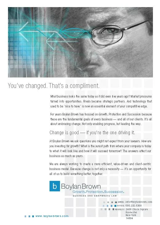
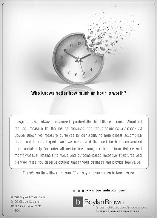
The Client: Boylan Brown
The Agency: Kurt Pakan Design
The Assignment: Communicate how progressive, innovative and open to change the firm really is.
The Answer: A campaign with original illustration and just as original copy that takes traditional legal advertising and turns it on its head. Or at least sideways.
The Client: Xerox
The Agency: Roberts Communications
The Assignment: Introduce a new travel scanner in PC World magazine.
The Answer: Don’t sell a piece of hardware. Sell the promise of less work. Plain and simple.
The Client: E&I
The Agency: Roberts Communications
The Assignment: After years of promoting cooperative purchasing to buyers at colleges...sell the concept to the C-suite ... the buyers’ bosses.
The Answer: Realize that college presidents don’t care about chairs and office supplies; these things are necessary evils. But you can still talk to them about their real interests—in fact you better.
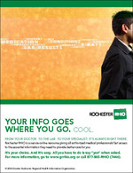
The Client: RHIO
The Agency: Roberts Communications
The Assignment: Let the community know there’s a very cool technology coming to doctor’s offices.
The Answer: Illustrate the real benefits; don’t just talk about them. And turn privacy concerns into the actual advantage.
The Client: Blue Cross and Blue Shield Association}
The Agency: Roberts Communications
The Assignment: Launch a brand new national discount program from the association to plans and members.
The Answer: On top of crafting ready-to-use language, banners ads, sales presentations and collateral, create templated ads that allow plans to brand them with their own logos and the most relevant partner discount in their region.
The Client: Corning
The Agency: Adams Colway and Associates
The Assignment: Combat eroding market share of glass photo sensitive lenses to plastic lenses.
The Answer: With 90%+ share of the glass lens market, when you promote the clear superiority of glass, you're really selling Corning. And who would argue with this guy ... or the new tag line?
The Client: ITT/Procast
The Agency: Roberts Communications
The Assignment: Tell engineers who have paid hundreds of thousands of dollars on pumps only to have them abandoned by the manufacturer that Procast can make any replacement part they need.
The Answer: Create a 1/3 page, black and white ad that outscored every full page four-color ad in the publication in terms of impact and memorability.
The Client: Farash
The Agency: Roberts Communications
The Assignment: Fill apartment vacancies near local colleges
The Answer: Talk about what college students really care about ... refrigerators, cable and privacy.


